The Healthiest Year of My Life
A diabetes self-tracking experiment
Summary
In 2012, I aggregated every diabetes-related data point in my life. This year-long personal project in self-tracking was rooted in my interest in data and design. I wanted to explore new ways of answering the question, “How am I doing?” In the process, I had the best year of diabetes management of my life.
My Role
I aggregated all the data for this project, did most of the analysis, and designed multiple ways of visualizing the readings. I worked with D’Arcy Saum, my co-founder at Databetes, to code several of the visualizations.
Background
Medical data has played a big part in my life since I was diagnosed with type-1 diabetes in 1986. I used a blood glucose monitor multiple times a day. I’ve been on an insulin pump since 1987 and a continuous glucose monitor (CGM) since 2010. These devices generate constant streams of information. My CGM gives me a new glucose reading every 5 minutes. That alone is about 100,000 readings a year.
In 2011, patients like me had no good way to manage all of this information. My devices didn’t talk to each other. Every piece of diabetes management software I’d tried was incompatible with the next. Even exporting data was sometimes challenging. If I wanted a good way to record lifestyle data like meals and activity, I had to use other mobile apps. All these scattered readings meant I received no insights to guide my daily treatment decisions.
That same year, I began grad school at NYU’s ITP (Interactive Telecommunications Program). The school focuses on exploring the latest technologies and building workable prototypes. There was growing interest in health data and wearables at the time. My classes included one called DIY Health taught by Steven Dean, the head of the NY chapter of Quantified Self. Much of this was new to me, but aligned with my interest in healthcare.
Meanwhile I was also working to get Databetes, the startup I founded, off the ground. I met a developer named D’Arcy Saum who became my co-founder. I was interested in looking past the technical challenges of data aggregation and interoperability, assuming those issues would be solved with time. My interest lay in exploring how patients could interact with all this information, learn from it, make better decisions based on it, and ideally live healthier because of it.
Personal Experiments
Diabetes is such a diverse condition that I wanted to start by narrowing my focus. What I knew best was my own experience, so I used this as a jumping off point to design, test, and iterate.
The first step was aggregating my data. I exported data from my blood glucose monitor, insulin pump, and CGM. I logged every meal I ate in a Google Docs spreadsheet, including a description of the food, estimated carbs, and whether I was eating at home or at a restaurant. I took photos of my meals, then uploaded them to Flickr (the dominant photo service at the time). I bought my first FitBit to measure activity and Runkeeper to record my runs. I also kept notes, recording key dates and memorable experiences.
As the year progressed, I focused on a few areas of my diabetes that I wanted to explore. The first was food. I’d been reading about low-carb diets in community posts by patients with diabetes. I wanted to explore whether I would feel better with a few small changes, particularly my choices for lunch. My glucose tended to be high in the afternoon and it left me feeling tired and sluggish. In one of my first data visualization projects called Insulin on Board, I explored the correlation of insulin totals and glucose control over 100 days. (This was a separate project that I did not include in the final poster).
Another area I explored was exercise. It was an unseasonably warm winter and I’d been doing long runs on the weekend. I’d run two marathons before and decided to sign up for my third, the Philadelphia Marathon scheduled for November 18. I knew from previous training that the more active I was the less insulin I needed. This was an opportunity for me to quantify that change.
Data visualization was an area that I had a growing interest in at this time. Nick Felton and his annual reports were a huge influence. I studied how both what he tracked and how he visualized the information evolved over 10 years. Clever Franke’s weather reports were equally compelling to me.
I was intrigued by the idea of a diabetes annual report, of helping a chronic condition patient see the trends throughout their year. My doctors would generate 14-day reports when I visited them, focusing on just the last two weeks even though I only saw them every 3 months. That’s the right level of fidelity for them. What about me as a patient? Should it be more fine grained, less, or both? I’d already been dealing with this condition for decades. Could a report like this help me see things differently, highlight a macro trend, perhaps nudge me to action and adjust my lifestyle in some way?
The Overview
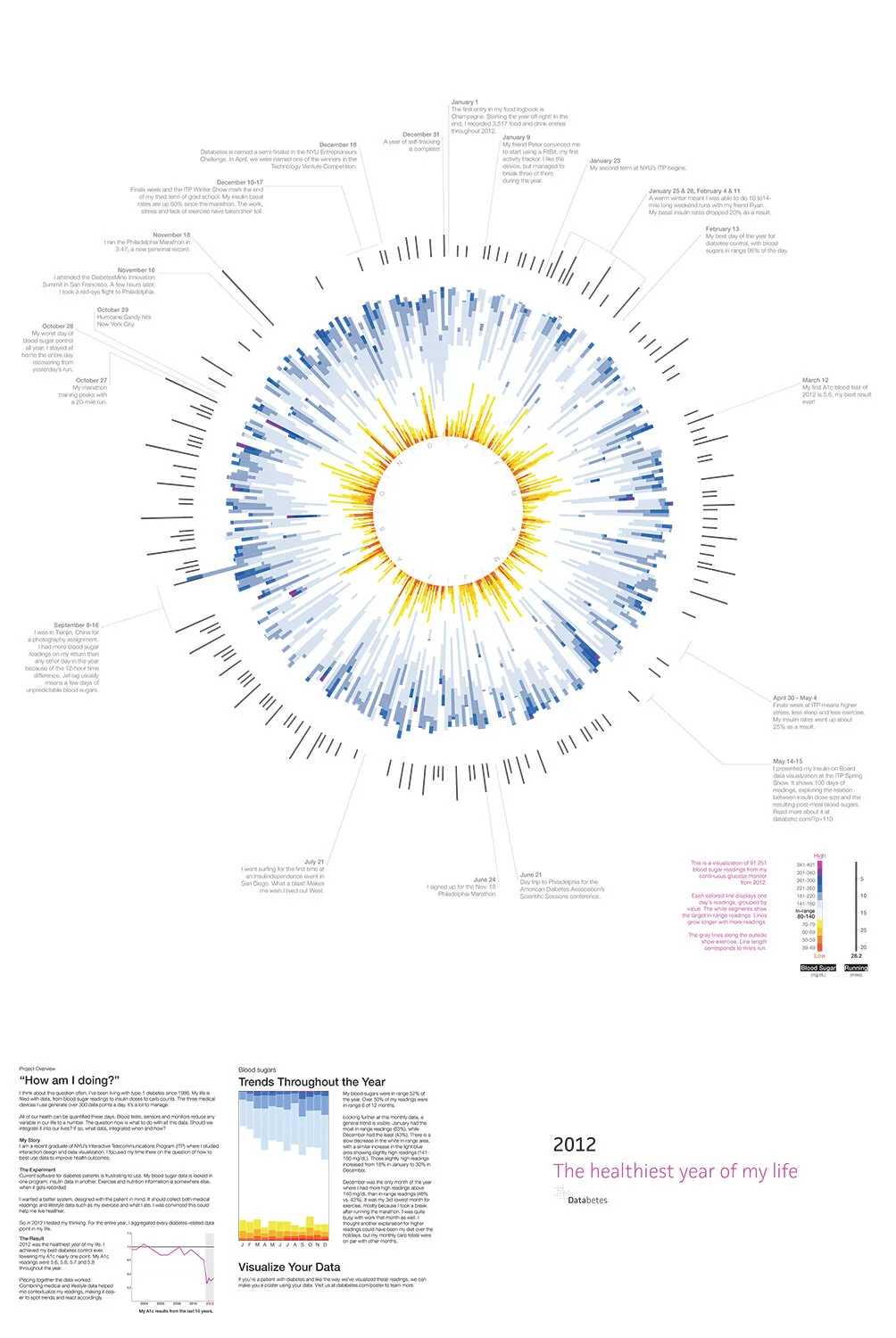
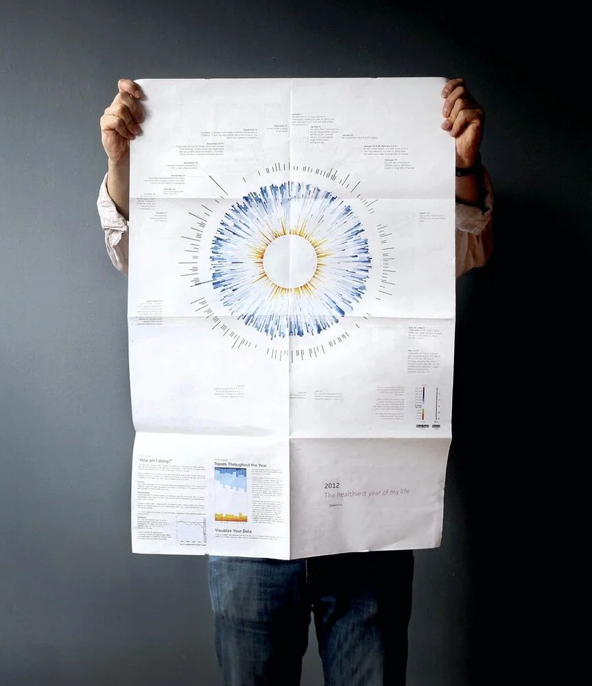
I spent the year very much in the weeds, making sure all my logbook entries were complete every day (manual logging ended up being quite a chore). Visually, I wanted a way to step back and look at all this information from a distance. I chose to design a poster because I wanted something big, something that I could pin to my wall, get a quick read on, but also study over time. I wondered things like whether my glucose is better in the Fall or Spring? Were there patterns in how often my glucose went very high or very low?

The front of the poster showed my macro trends throughout the year. I started with the ~91k glucose readings from my CGM. A circular visualization would be a compact use of space and allow me to make the comparisons I wanted. I categorized the readings with a new color palette. I was less interested in when my glucose was in range, so those readings appeared in white. Low glucose readings are the most dangerous, so I assigned them a range of hot colors. High glucose readings, a range of cool colors.

I thought of the graphic like a clock. A line represented each day, presented in chronological order, moving clockwise. January 1st was at 12 o’clock, February 1st around 1 o’clock, and so on. The length of the line varied based on the number of glucose readings that day. The line on September 16 was the longest because I’d flown back from China, adding 12 hours of readings to the day.
I also wanted to compare my exercise and glucose readings. I added another set of lines outside the glucose readings. Each mapped to a day, the line length corresponding with the number of miles I ran. It shows my marathon training kick off, peak, and finish.
I added one final ring of information to help tell the story of the year. On relevant days I included notes that were either important or fun to me.
D’Arcy and I coded the visualization using the Javascript library D3. We experimented with a few of the design variables like line height and thickness. We also tried a few variations on the color palette. But ultimately the initial idea held up. It was a unique, compelling visual as a whole. It allowed viewers to zoom into specific days and see context in weeks, months, and seasons.
Diabetes Metrics

The title of this project references my HbA1c blood tests for 2012. Patients get this test on average every three months. It provides a way to measure glucose control. The lower the number, the better. It’s recommended that patients achieve 7.0% or below to lower their chances of long term diabetes complications. Throughout 2012, I achieved the best results of my life: 5.6, 5.8, 5.7, and 5.8.
My expectation had been that 2012 would be just a year of gathering data and setting up a baseline. I assumed my glucose control would improve in later years with the help of new tools that I’d designed. Nonetheless, the increased engagement with my data had an immediate impact. In particular, my experiments with a low-carb diet had the biggest impact by reducing the number of post-meal spikes in glucose.
Slicing the data another way, I was surprised by the trends evident in a month view. Throughout the year, my control slowly slipped. Perhaps my obsession with data faded a bit as the project proceeded.
Storytelling
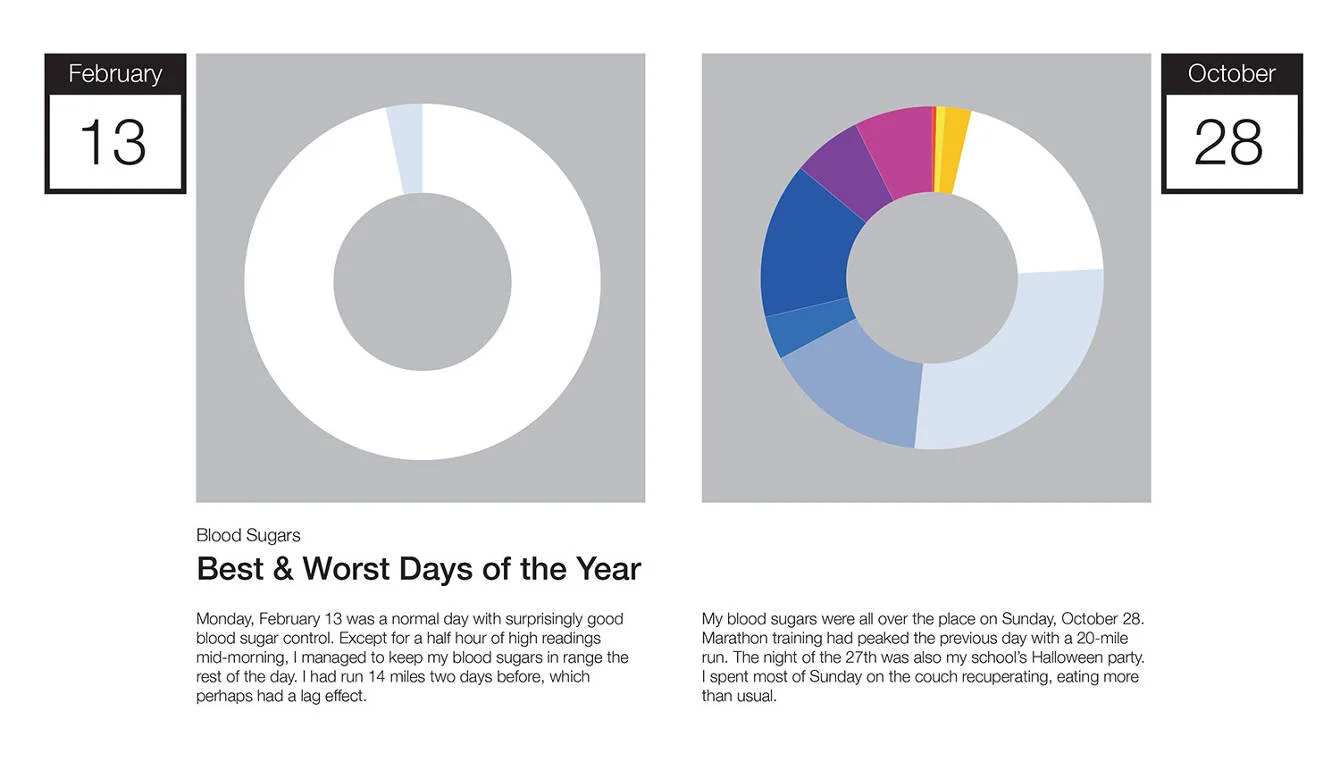
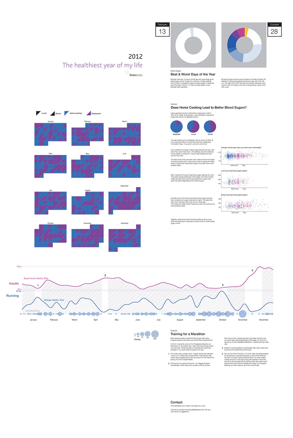
On the back of the poster, I gave more details on specific aspects of the year. I was interested in which days were my best and worst, as well as the context on why. It was easiest to define what it means to be the best day since February 13th stood out as the one with the most in range glucose readings. Defining the worst day was trickier. Was it the one with lowest number of in range readings, the greatest volatility, or the highest average glucose? October 28th was bad on many of those fronts, mostly because of too many snacks.
Home Cooking
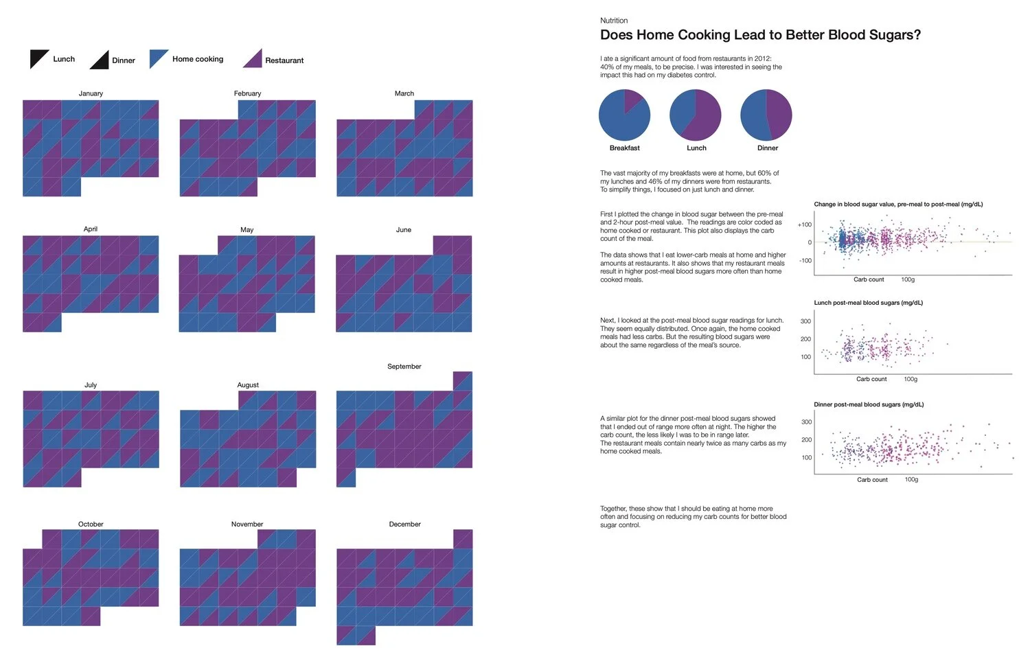
Another variable I wanted to test was how my glucose fared with home cooking versus restaurant meals. I plotted the data multiple ways based on which meal it was, carb count, and pre/post meal glucose. It showed that I ate lower amounts or carbs and was more likely to have my glucose in range if I ate at home.
Insulin vs. Activity
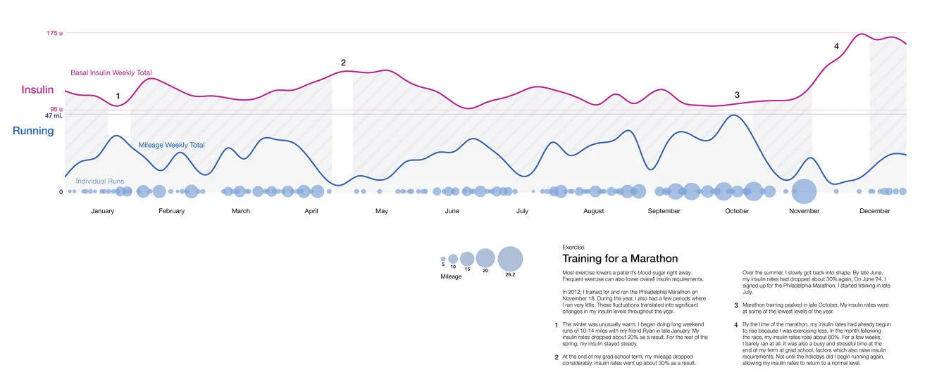
In June of 2012, I signed up for the Nov. 18th Philadelphia Marathon. I’d taken advantage of the warm weather throughout the winter and done several long runs. I then kicked off a standard 18-week training cycle.
I compared my insulin rates to my weekly running mileage to quantify the effects of this activity. I focused solely on my basal insulin, the rates I set in my insulin pump to keep me steady throughout the day. I tend to see a lag effect after runs, often crashing overnight following a morning run. The winter runs mapped to a 20% decrease in my insulin. In the Spring, my mileage decreased and insulin rates increased around the end of the school year and finals week. My training peaked a few weeks before the marathon. After the race, I took a few weeks off to recover. My insulin rates spiked 60% as a result.
It was equally interesting to compare the static image versus an animation of these readings. This visualization has led me to explore other ways of replaying data to help patients better understand the cause and effect of some data sets.
Quantified Self
Armed with all this information, I signed up for my first Quantified Self (QS) presentation. I had attended several Meetups for the New York City chapter and had gotten a better sense of the group. The guidance was to cover 3 topics in 5 minutes: What you did, how you did it, and what you learned.

I was invited to do several presentations to QS audiences over the next year. The most memorable was an April 2014 presentation at the Quantified Self Public Health Symposium. The audience included the CTO of the U.S. Department of Health & Human Services and other leaders in the health care sector.
Feedback
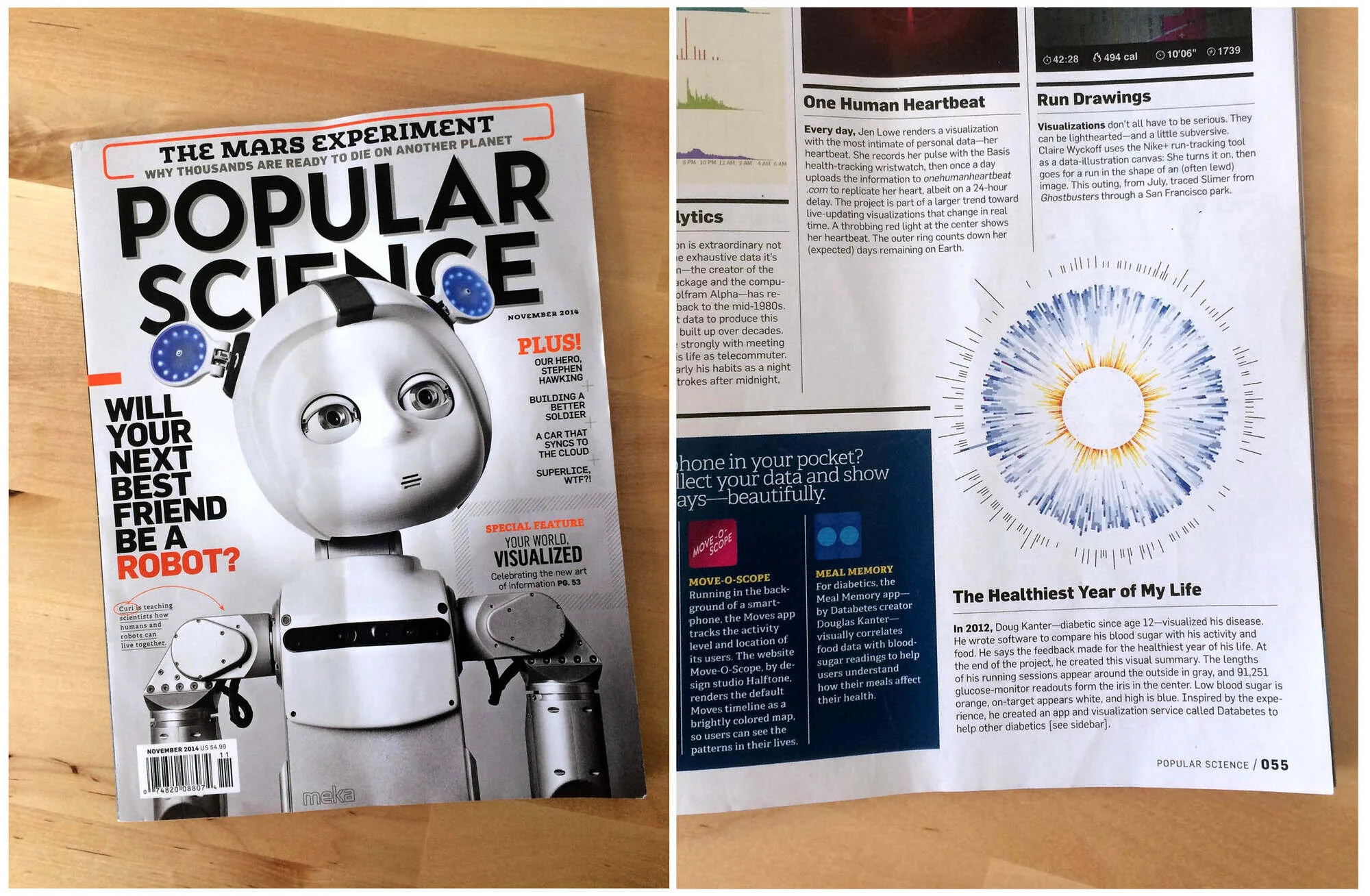
This project was featured in Manuel Lima’s Book of Circles, an exploration of circular data visualizations, and in a Popular Science magazine segment on data visualization.
Final Thoughts
Groups like Quantified Self are early adopters. Their projects are sometimes met with skepticism. Yet the people who have thought about and run personal experiments are tackling problems that are real to them, often with new technology that the average primary care physician has no time (or interest) to evaluate. I’m intrigued by efforts by some hospital systems to now leverage these n=1 studies and see which ones could have broader applicability to other patients. This is how progress is made, small experiments and iteration.
It was valuable for me to explore self-tracking for a year while in grad school and strategizing Databetes business ideas. Framing this as a personal project gave me the freedom to create something unique without having to worry about whether the solution was applicable to a wider audience of diabetes patients.
Work in healthcare often comes with a set of assumptions of how systems must work, including the roles of healthcare providers and patients. This was a purely patient-centric approach, finding ways to evolve how information is communicated. It’s a challenge for segments of the patient population to make sense of their data, spot trends, and generate a plan of action in response.
If we are looking for technology to supplement the doctor in between clinic visits, we need to get better at storytelling. Healthcare can learn from other industries about how best to do that. We’ll need to deliver compelling, engaging visuals that can be auto-generated and support a range of inputs and edge cases. To gain wider adoption, they’ll need to be adequately personalized per patient and delivered in the right tone. Diabetes is an emotional condition. The role of the healthcare provider as someone who listens and responds appropriately is not easily mimicked by technology. To scale projects like this and gain widespread adoption, the biggest challenge will not be what to say but how to say it. A design that is conversational, that walks a patient through the data, from overview to details to action plan, step by step, would be a great approach to explore next.