Dexcom Clarity Reports
Redesigning Dexcom’s diabetes management software
Summary
Dexcom’s Clarity software provides insights into patients’ retrospective continuous glucose monitor (CGM) data, patterns, and trends. It is available to healthcare providers (HCPs) on the web. Patients can use both the web and a mobile app to access their reports. It supports our core market of intensive insulin therapy (IIT) patients.
Clarity was designed with a focus on managing glucose information. Yet new data is expected to flow automatically from Dexcom’s partners. This includes insulin, food, and activity readings from medical device and digital health companies. With this change, Clarity required a new design to properly display this information to users.
My Role
I conducted user research, synthesized the findings, and led the strategy for a new modular design. Over the course of the project, I transitioned the design work to a team of 2 designers and a researcher on my team.
Background
I was assigned to this project shortly after joining Dexcom in 2017 as a Senior Manager of User Experience Strategy. It was originally focused on visualizing data from an insulin pump partner. As I explored the original project brief, I refocused the work to designing a system that could scale in the future as needed.
Research
I kicked off the project using a double diamond approach, starting with discovery research.
I conducted hourlong, one-on-one interviews with 12 IIT patients and 12 HCPs. The patients were on CGM (any brand) and were a mix of insulin pump and insulin pen users. The HCPs were a mix of endocrinologists (endos), certified diabetes educators (CDEs), and primary care physicians (PCPs). Questions focused on their approach to diabetes management. Participants were then shown insulin and glucose reports from 4 competitors (Medtronic CareLink, Glooko, Tidepool, and Tandem).
Synthesis
The interviews highlighted different needs and approaches to diabetes management among the two audiences.
Patients
This project occurred a few months after I completed the Decision Support project. I leveraged the IIT patient personas that were generated as part of that work.
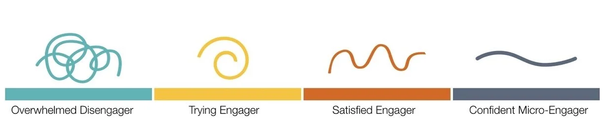
Overwhelmed Disengager: Individuals with poor A1c’s who are not making recent progress.
Trying Engager: Bear similarities to the ‘Confident’ and ‘Satisfied’ Engagers, but are differentiated by a characteristic serious blocker - a problem or issue that prevents them from achieving the control they desire.
Satisfied Engager: The largest group, they are engaged in their own care and have good A1c’s. A major differentiator is their interest in finding balance between the various commitments in their life to diabetes, work and family.
Confident Micro-Engager: Represents the top end of individuals in terms of time allocated to diabetes. They are highly engaged in their care, have the lowest A1c’s and make diabetes a high priority.
Within this framework, the interviews showed trends in their:
Relationship with their HCP: This included their expected role in their own diabetes management.
Use of reports: Frequency and reason for opening Clarity.
Report preferences: Mobile vs. web, plus their desired views of the data.

HCPs
The amount of time clinicians were able to spend with patients during clinic visits was a major themes.
PCPs: Most pressed for time.
Best case scenario, they had ~20 minutes with a patient to address all their health issues.
Of that, they would spend ~5 minutes of that time to discuss their diabetes.
The three key steps were:
Interpret their data.
Decide on treatment changes.
Communicate to the patient the reasons for the changes in order to get buy-in.
Endocrinologists: Available for a moderate amount of time.
Generally have 20-30 minutes with patients.
Often makes a quick determination whether their glucose control needs a “fine-tuning versus an overhaul.
CDEs: Most time available.
Usually have an hour with patients, with ~45 minutes focused on their reports.
Described themselves as being a “detective” focused on the data.
Have time to address nutrition, insulin dosing, activity and other issues in detail.

With time constraints, HCPs varied in their report preferences. Some wanted help with data interpretation so they could focus on communicating with the patient. Others would use the report’s analysis as a starting point, but double check the conclusions on their own.
Prioritizing issues, they often started by looking at basal insulin dosing and incidents of hypoglycemia. Next they looking at nutrition and incidents of hyperglycemia. If the patient needed help with meal dosing, a PCP or endocrinologist would assign a CDE or other mid-level staff to assist.
Comparing Reports
Both patients and HCPs were shown the same set of reports from Medtronic Carelink, Glooko, Tidepool, and Tandem.
Opinions on the reports varied. One side of the spectrum were PCPs and most patients who wanted a quick summary of the data. On the other side of the spectrum, CDEs and the most highly engaged patients wanted both an overview and detailed daily views to figure out what was “really going on.”

Medtronic CareLink
Participants were shown all the reports that the software produces including:
Dashboard
Episode Summary
Adherence
Daily Detail
These reports were popular with HCPs who were familiar with it, less so for those who were not.
“This report, it’s so awesome… Everything else is a fishing expedition. I don’t want to fish.” (CDE)
“There’s just a lot going on there… What you really want is not all the data at once.” (PCP)
Most patients found these reports overwhelming.
“This stresses me out, honestly.” (Type-1 patient)

Glooko
Participants were shown the summary and daily reports.
Both patients and HCPs thought it succeeds as an overview.
“This is a good summary. It gives me a high level overview… I look at spreadsheets at work, I don’t want to come home and look at that again.” (Type-1 patient)
“I like the simplicity to it. “ (CDE)
Often compared to the Tidepool report, all participants preferred Glooko.

Tidepool
Participants were shown the summary and daily reports
Most patients were drawn to the Glooko and Tidepool reports. After comparing the two reports, every patient chose Glooko because of the design and amount of information.
“It’s a little too simple. There’s not enough data.” (Type-1 patient)
“Pretty similar [to Glooko]. I think very similar. I think I like Glooko better.” (Endo)

Tandem
Participants were shown the summary and daily reports.
Feedback from patients and HCPs was similar, finding the software the least intuitive and requiring the most time to process the information.
“This one, you really need to think about… This one’s not as easy to decipher.” (Type-1 patient)
“Some of it doesn’t make sense to me… I get a little confused and frustrated sometimes with the T:Connect reports, especially this one.” (CDE)
Synthesis
Several themes emerged from the research, echoed in both the patient and HCP feedback.
Time on Task
The research highlighted the varying goals of patients and different HCPs viewing Clarity. Some spent little time looking at reports and only wanted a quick summary of data. Others checked the data often with the goal of optimizing treatment decisions.
A Patient’s Job vs. an HCP’s job
Highly engaged patients who were very literacy about their diabetes showed varying willingness to make changes to their own treatment on their own (including insulin pump settings). Some made changes any time they felt it was necessary. Others only felt comfortable making small changes, like their pump’s basal insulin rates. A third segment saw it as the HCP’s job to tell them what changes to make. The reports were perceived as requiring too much effort or were seen as a “black box.”
“Some patients will change their settings in between, others are terrified and won't touch it. “ (Endo)
“I don't make any changes without consulting with my endocrinologist even though she's kind of given me the freedom to do it. I still like to get the confirmation of, ‘Hey, this is what I'm seeing, what do you think?’ (Type-1 patient)
Insulin on Board
Many of the reports showed both insulin doses and insulin on board (IoB) on graphs. Most patients struggled to explain the action curve of their insulin or how long it was active in their bodies. Their expectation was that the bolus calculator on their pumps would do the work for them. If graphs did display IoB data, they did not factor it into their interpretation.
“The whole concept of insulin on board, you can explain that to them but somehow it just doesn’t sink in.” (CDE)
Patient Pattern Recognition
For proactive patients, a 3-day pattern was consistently mentioned as enough data to make changes to their insulin pump basal rates.
HCP Approaches to Reports
A 14-day report was the standard time range for an HCP, even when months of data was available. It was seen as the most relevant, enough to be actionable, without being overwhelming. If a patient was on an insulin pump, HCPs often would start by reviewing changes to their basal rates since their last visit. Next they would compare those rates to an hourly breakdown of an overlay glucose report. After basal rates were addressed, their focus turned to frequency and severity of hypoglycemia. Last, a look at bolus dosing and hyperglycemia.
Clinic Tech Challenges
HCPs described multiple ways that they struggled to support medical device data.
Data uploads: Medical Assistants were tasked with uploading data from insulin pumps, blood glucose monitors, and CGMs. Most had given up on asking patients whether they had already uploaded their own data or not because their answers were often long and unclear. As a result, they simply uploaded all device data themselves.
IT Support: Clinics struggle to get support from their overextended IT teams. HCPs also felt pressed for time and were unwilling to sort through issues themselves.
“I have enough to do without being a computer guru.” (Endo)
Firewalls: The move to cloud-based diabetes management software often conflicted with health system security measures. Entire brands of device software were often inaccessible. Decisions are made at corporate offices, blocking the local IT support from being able to get an exception for an individual clinic. As a result, either a patient generates a report on their own at home or the HCP does not review that device’s data.
Internet: Clinics often have bad internet coverage from their wi-fi router and poor cell tower coverage. Any issue that required a patient to download new software or reset a password so they could grant the clinic a permission was considered too time consuming to resolve during the visit.
EHR Integration: Clinics struggled (most often with Epic) to get reports into the EHR. Many printed the reports, then scanned them in. Some HCPs proposed solutions where the software could fax the report to the clinic without a log in. The most common approach was to attach the PDF to the media tab.
Fear of Software: Smaller clinics were afraid that less common brands of software would break their computer.
“Every time we would add a new software to our computer, it would crash and nothing else would work. We went through this so many times.” (Endo)
Report Usage
An update to Clarity needed to be considerate of the two main determinants of Clarity usage, time spent looking at reports and the goal of reviewing data. For those that did review reports, their usage could be assigned one of three tiers. These inform the choice of what reports to produce and expected usage.

Summary: A quick and clean, high level overview of the most important data
Analysis: Multiple reports that detail different areas in need of treatment changes.
Daily: A detailed display of all aggregate data.

For patients, interviews supported the idea that Clarity usage increases with the level of engagement in self-management. Overwhelmed Disengagers rarely review retrospective reports. Confident Micro-Engagers are frequency reviewing Summary and Analysis reports and occasionally reviewing Daily reports.

Expected usage of reports among HCPs can be mapped to their role and time spent with patients engaged with their diabetes data.
Design
The team generated a number of initial designs using this framework to flesh out the concept and gather feedback from stakeholders.
Consideration for both web and mobile view.
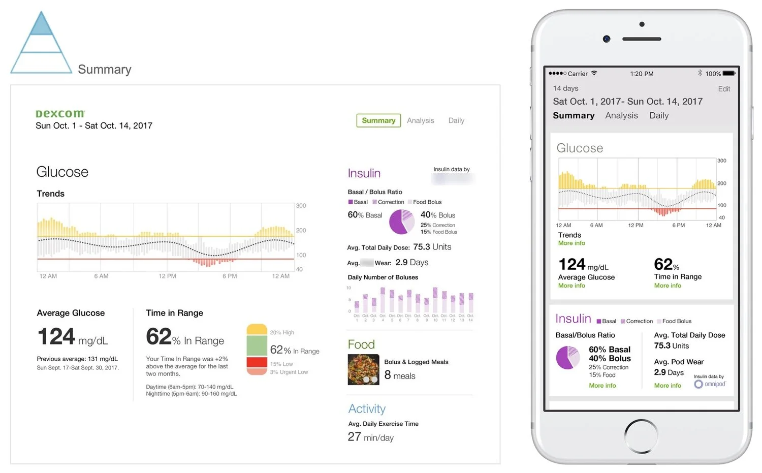
Summary
This design concept is a 14-day report focused first on two key statistics, average glucose and Time in Range (TIR). Both statistics offer a comparison to the previous two week range, giving some context to trends within the month.
The Trend graph provides an additional level of detail by showing glucose throughout a composite day.
Summary insulin data is grouped in several important ways. It compares the basal/bolus split (many HCPs look for this to be about 50/50). Additionally the report provides overviews of total daily dose and average number of bolus doses, important data points according to our Clinical team.
Finally, there are small summaries on food and activity. Additional data on these readings would be available in other reports.
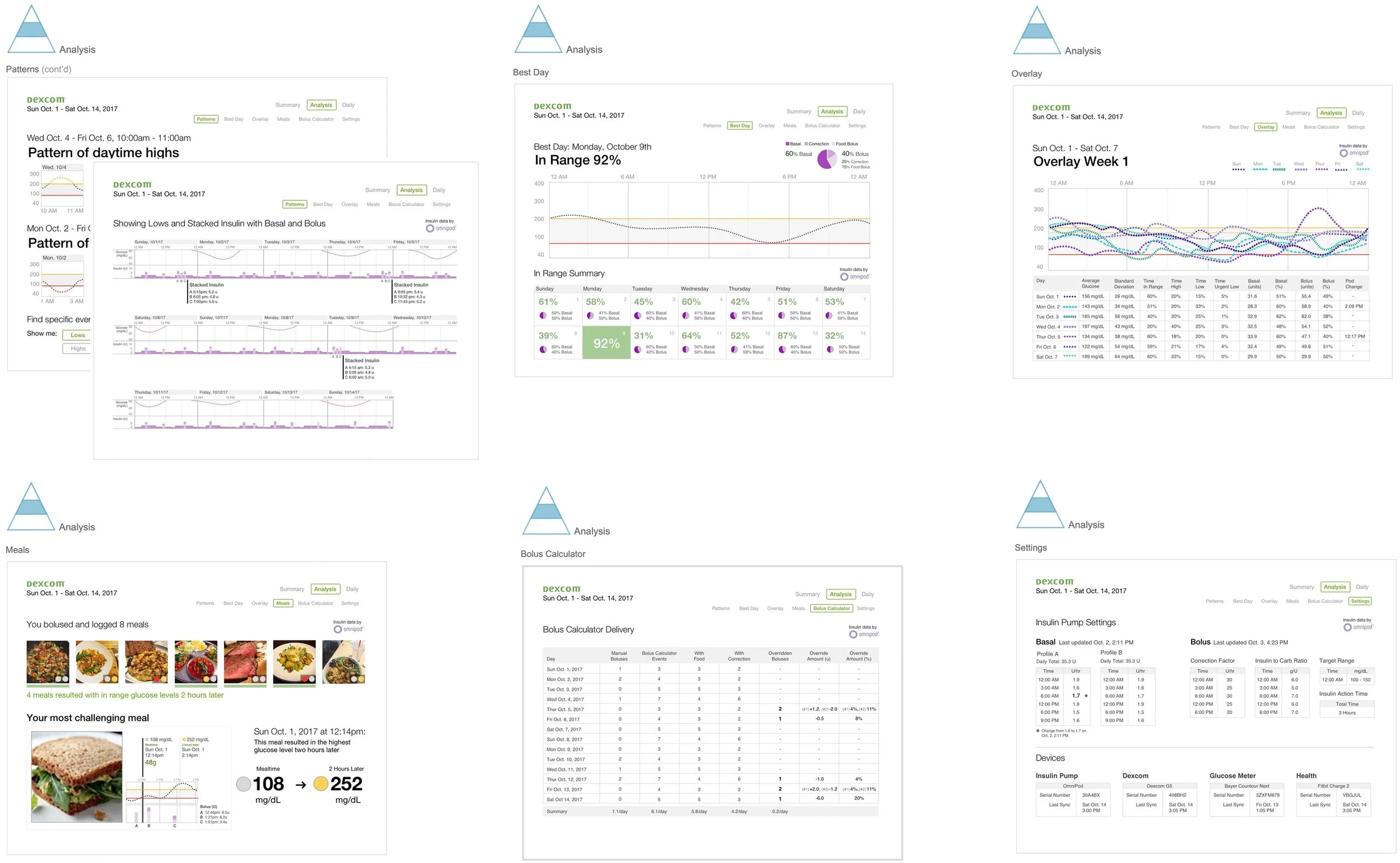
Analysis
This section includes 6 reports for an IIT patient on an insulin pump:
Patterns: Focus on identifying times of the day where a patient’s glucose is consistently low or high, along with insulin pump data.
Best Day: Highlight a win, this report intends for a patient to think about what they did that day and whether some behaviors could be repeated.
Overlay: A weeks’ worth of glucose readings stacked on one graph along with daily statistics.
Meals: A focus on photo-based meal logging and analysis of the patient’s glucose several hours after eating.
Bolus Calculator: Likely used by an endo or CDE, this report could help determine what part of meal dosing is challenging for the patient (i.e. carb counting estimatation, overriding recommended doses, etc.)
Settings: Support for connected medical devices, including highlights for changes to insulin pump basal rates.
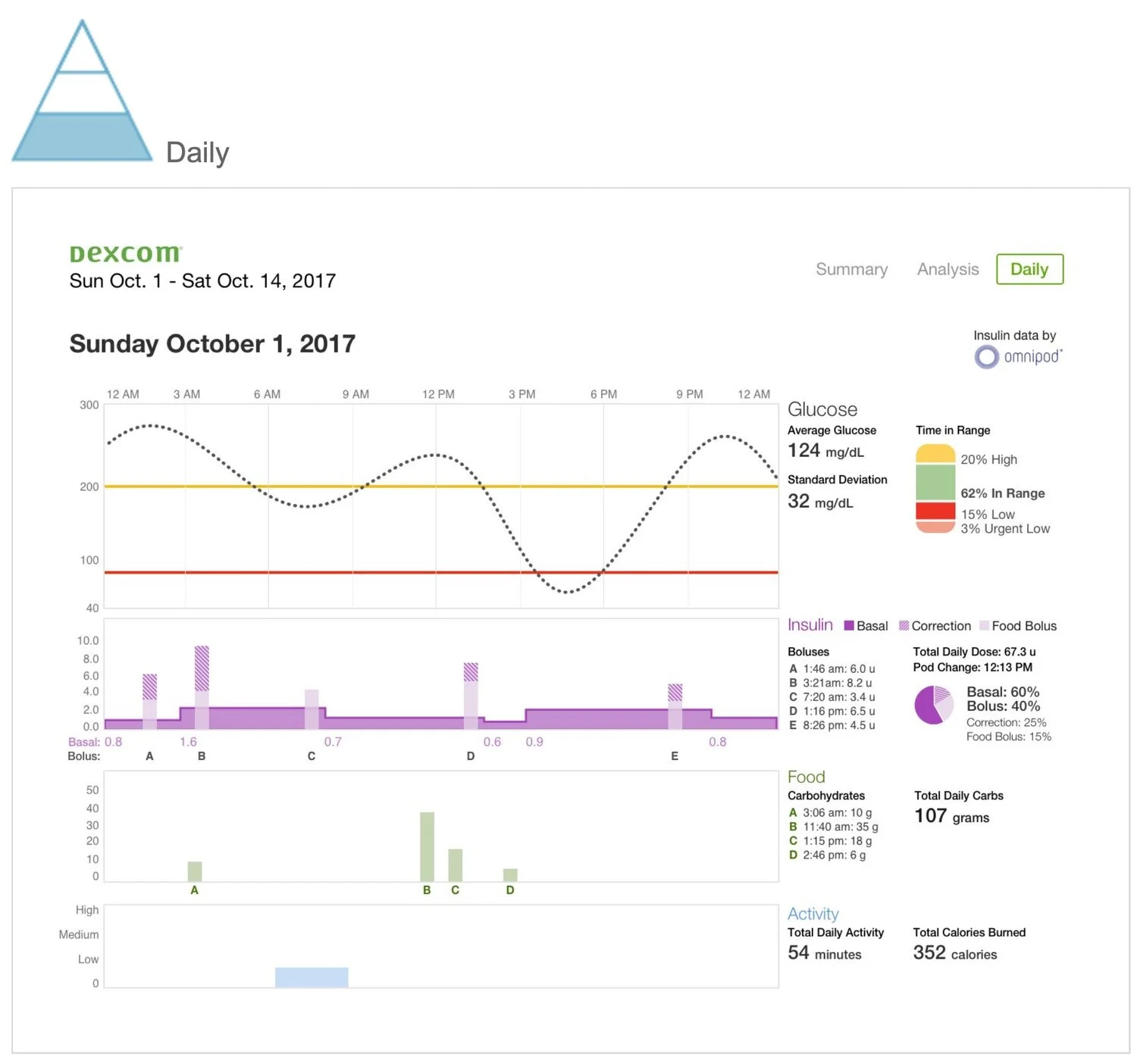
Daily
A detailed view designed to help users see cause and effect across data types. It begins with a glucose view to show the day’s outcome. Insulin data below with food data below.
Delivery
The initial concepting phase was followed by additional rounds of design, testing, and iteration. The version that reached the market maintained several key elements of the initial concepts, including a modular and scalable design. The overview report maintained its focus on a few key data points. The UI was also refreshed with a card layout.
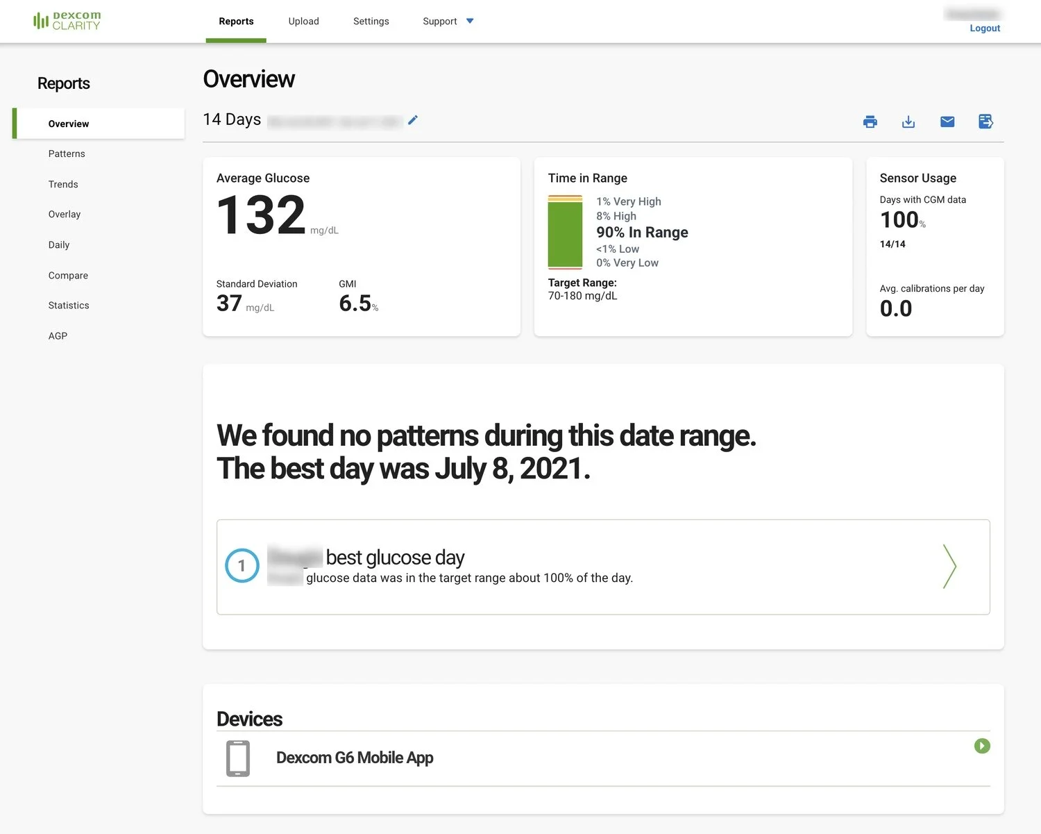
The current version of the Clarity overview report.
Final Thoughts
Work on Clarity highlights that good design is conversational. With an ever-increasing amount of information available, the data being displayed needs to start with the general and move into specifics. These reports ask “how are you doing?” with different expected answers. It mirrors sitting down with someone for the first time in months. First you want the summary, then increasing levels of details.
The Clarity redesign provides a scalable way to interpret patient data. The software continues to rank well in surveys. It now has a solid foundation on which to grow. With additional data it will be able to provide improved analysis and pattern recognition to both patients and HCPs.